저번에 TIFY 프로젝트를 진행하며 스토리북을 어떻게 활용했는지 글을 쓴 적이 있다.
https://gugu76.tistory.com/112
해당 글에서는 진짜 스토리북의 최소한의 기능들만 활용해서 스토리를 작성하고 테스트해봤기 때문에 이번에는 스토리북의 문서화 기능들을 좀 더 알아보고 활용해보는 시간을 가져보려 한다.
먼저, 기존에 작성한 스토리 문서들은 조금 설명이 부족했던 느낌이 있어서 문서화를 좀 더 자세하게 진행해보려 한다.
일단 목표는 다음과 같다.
- 각 컴포넌트의 props 타입과 설명을 명시한다.
- 컴포넌트에 대한 설명과 각 스토리에 대한 설명을 추가한다.
ArgsTable 수정
현재 FriendsListA 컴포넌트의 ArgsTable은 각 스토리에서 넘겨주는 args를 토대로 자동 추론되어서 채워진다.
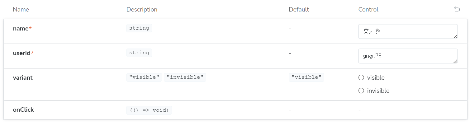
이때, 타입이 정확하게 추론되지 않는 경우도 존재하기 때문에, 명확히 args의 타입들을 지정해주는 것이 좋다.
이는 스토리를 생성해줄 때 스토리 객체에서 argTypes 속성을 추가해주면 된다.
argTypes에 사용할 수 있는 값들은 다음과 같다.
- name: props 이름
- description: props에 대한 설명
- table
- type: props 타입
- defaultValue: props 초기값
- control: props 값을 수정하고 싶은 경우 어떤 방식으로 제공할지
- type: control 타입 설정
아래 표는 control의 type에 사용할 수 있는 항목들에 대한 표이다.
| Data Type | Control | Description |
| boolean | boolean | Provides a toggle for switching between possible states. argTypes: { active: { control: 'boolean' }} |
| number | number | Provides a numeric input to include the range of all possible values. argTypes: { even: { control: { type: 'number', min:1, max:30, step: 2 } }} |
| range | Provides a range slider component to include all possible values. argTypes: { odd: { control: { type: 'range', min: 1, max: 30, step: 3 } }} | |
| object | object | Provides a JSON-based editor component to handle the object's values. Also allows edition in raw mode. argTypes: { user: { control: 'object' }} |
| array | object | Provides a JSON-based editor component to handle the values of the array. Also allows edition in raw mode. argTypes: { odd: { control: 'object' }} |
| file | Provides a file input component that returns an array of URLs. Can be further customized to accept specific file types. argTypes: { avatar: { control: { type: 'file', accept: '.png' } }} | |
| enum | radio | Provides a set of radio buttons based on the available options. argTypes: { contact: { control: 'radio', options: ['email', 'phone', 'mail'] }} |
| inline-radio | Provides a set of inlined radio buttons based on the available options. argTypes: { contact: { control: 'inline-radio', options: ['email', 'phone', 'mail'] }} | |
| check | Provides a set of checkbox components for selecting multiple options. argTypes: { contact: { control: 'check', options: ['email', 'phone', 'mail'] }} | |
| inline-check | Provides a set of inlined checkbox components for selecting multiple options. argTypes: { contact: { control: 'inline-check', options: ['email', 'phone', 'mail'] }} | |
| select | Provides a drop-down list component to handle single value selection. argTypes: { age: { control: 'select', options: [20, 30, 40, 50] }} | |
| multi-select | Provides a drop-down list that allows multiple selected values. argTypes: { countries: { control: 'multi-select', options: ['USA', 'Canada', 'Mexico'] }} | |
| string | text | Provides a freeform text input. argTypes: { label: { control: 'text' }} |
| color | Provides a color picker component to handle color values. Can be additionally configured to include a set of color presets. argTypes: { color: { control: { type: 'color', presetColors: ['red', 'green']} }} | |
| date | Provides a datepicker component to handle date selection. argTypes: { startDate: { control: 'date' }} |
이 설명을 바탕으로 스토리북 props 타입과 설명을 좀 더 추가해보고 어떻게 달라지는지 확인해보도록 하자.
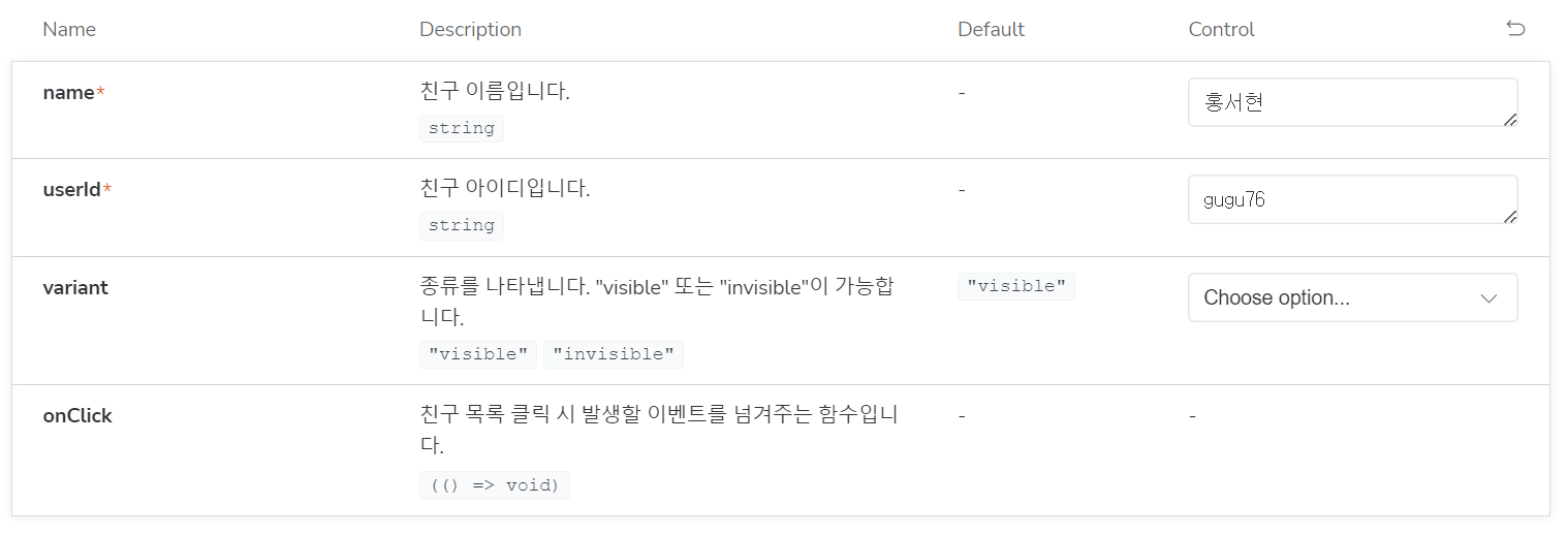
아래와 같이 FriendsListA 스토리 객체에 argTypes를 추가해주었다.
argTypes: {
    variant: {
      name: 'variant',
      description:
        '종류를 나타냅니다. "visible" 또는 "invisible"이 가능합니다.',
      control: {
        type: 'select',
        options: ['visible', 'invisible'],
      },
    },
    name: {
      name: 'name',
      description: '친구 이름입니다.',
      control: {
        type: 'text',
      },
    },
    userId: {
      name: 'userId',
      description: '친구 아이디입니다.',
      control: {
        type: 'text',
      },
    },
    onClick: {
      name: 'onClick',
      description: '친구 목록 클릭 시 발생할 이벤트를 넘겨주는 함수입니다.',
      control: {
        type: 'function',
      },
    },
  },
그랬더니 아래와 같이 props들이 명확하게 보이는 것을 알 수 있었다.
description
이제 컴포넌트 자체에 대한 설명을 추가해보도록 하자.
여기서 스토리 객체의 두 속성을 활용해보려 한다.
이는 componentSubtitle과 description인데, componentSubtitle은 컴포넌트에 대해서 간략하게 한 줄로 설명하는 역할이고, description은 자세하게 부연 설명하는 역할을 한다.
description에는 사용자가 선택할 수 있는 값의 종류를 명시하기도 한다.
아래와 같이 FriendsListA 스토리 객체에도 추가해주었다.
parameters: {
    componentSubtitle:
      'FriendsListA는 친구 목록을 나타내는 첫 번째 종류입니다.',
    docs: {
      description: {
        component:
          '- variant 값으로 "visible" | "invisible" 중 하나를 선택할 수 있습니다.',
      },
    },
  },
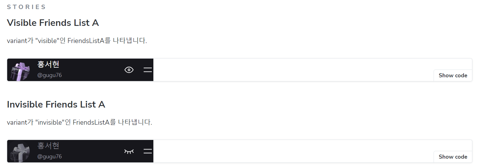
이제 마지막으로 스토리 설명을 추가해보자.
아래와 같이 주석을 추가해주었더니 각 스토리에 대한 설명도 추가된 것을 볼 수 있다.
/**
 * variant가 "invisible"인 FriendsListA를 나타냅니다.
 */
export const InvisibleFriendsList_A: Story = {
  args: {
    variant: 'invisible',
    name: '홍서현',
    userId: 'gugu76',
  },
}
앞으로는 이렇게 스토리북의 문서화 기능에도 신경을 쓰면서 작업을 해봐야겠다는 생각이 들었다.
이전에 작업한 스토리 문서보다 훨씬 명확해진 거 같아서 뿌듯하다.
참고 자료
https://iyu88.github.io//storybook/2023/04/07/storybook-docs.html
https://storybook.js.org/docs/react/essentials/controls
'프로젝트 개발일지 > TIFY' 카테고리의 다른 글
| 올바른 추상화와 선언적인 코드 작성하기 (7) | 2023.10.30 |
|---|---|
| 타입 가드로 해결한 Array.map is not a function 에러 (2) | 2023.10.11 |
| 함수 반환 타입을 명확히 지정하고 특정 프로퍼티를 가지는 타입도 지정해보자 (0) | 2023.10.05 |
| 구체적인 타입을 지정하고 재사용성이 있는 코드를 작성하자 (0) | 2023.09.28 |
| Storybook을 활용해서 개발해보자 (0) | 2023.09.10 |


